Most of today’s theatrical productions, from regional theater shows to mega-budget Broadway musicals, are delivering more colorful and impressive visual elements than ever before. Moving lights, moving scenery, and increasingly sophisticated projections are allowing greater possibilities onstage. But there are times when limitations can inspire innovation, and when less really does mean more.
The current production of Harold Pinter’s Betrayal on Broadway features a simple setup: Three main cast members, two chairs, a table… and a lot of room on a stage, featuring a multi-tonal gray wall in the background. Eight equidistant LED rows hang overhead, two blocks of LEDs shine down from in front of the proscenium arch, and balcony spots are used sparingly. The entire show is focused on the protagonists and their loaded dialogue about friendship, love and infidelity, and Jon Clark’s lighting shifts appropriately to reflect changes in mood and tone.
I appreciated this simplicity (and boldness, in a Broadway setting), and wondered how other designers on both the lighting and scenic fronts have dealt with productions that were unadorned or scaled back from something larger.
Scenic Designer Anna Louizos
“I would say a stripped-down, minimalist approach to a design can be an aesthetic choice, other times it can be an economic choice,” says Tony Award-nominated scenic designer Anna Louizos. “Often, designers are faced with a variety of scenarios whether it is Broadway, off Broadway, regional, or off-off Broadway. The parameters vary a great deal. I have had to make adjustments to designs that were initially conceived with automation, moving pieces, and multiple locations, only to be told that it exceeded the budget.”
Louizos invokes Avenue Q, the irreverent, Tony-winning musical which she and director Jason Moore first conceived on a grander scale during its original out-of-town run.
“[For] the show, we imagined moving buildings that tracked and rotated, and had automated expanding interiors — a whole variety of looks to fulfill the multiple locations in the neighborhood,” explains Louizos. “When we presented the model of the design to the co-producers of the show [the Vineyard Theatre and the New Group], their response was there was no way they could afford this approach. We had to go back to the drawing board and re-think a new concept for the piece. We stripped it down to its essence, took a fresh look at it knowing the parameters, and conceived it more as an advent calendar-like set. We came up with simple but clever ways to convey the puppet interiors, and add some surprises to some of the scenes, such and the Rod and Nicky beds. But overall, this simple, manually operable set became the definitive look for the show, which I’ve discovered seems to be a favorite for people to copy.”
Scenic Designer Beowulf Boritt
Tony Award-winning scenic designer Beowulf Boritt, like Louizos, is known for impressive and detailed-oriented set design. He has also faced having to scale things down. He says that his approach to design is almost always the simplest thing he can put on stage. “Sometimes, that simple impetus still leads to large and complicated sets, but I always try to think what the most pared down image is I can create that will tell the story,” says Boritt.
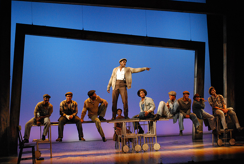
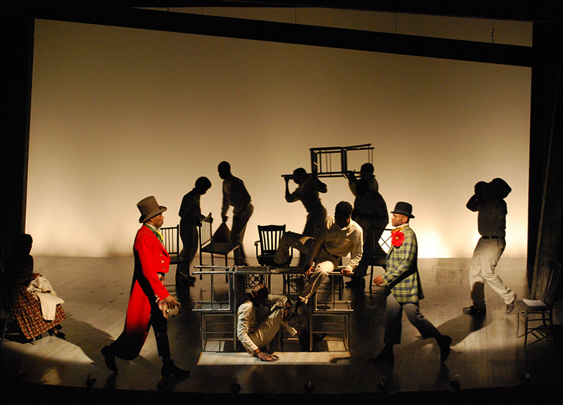
One of his favorite simple designs was for The Scottsboro Boys musical by composer John Kander and lyricist Fred Ebb that he designed for director Susan Stroman at the Vineyard Theatre Off-Broadway.
“We conceived the musical as a post modern minstrel show where the white characters were played by actors, rather than the other way around, as it was in the traditional racist form,” recalls Boritt. “Minstrel shows typically were just a semi-circle of performers in chairs, who stood up to perform their bits. So the set for The Scottsboro Boys was essentially 12 chairs that I designed to be able to lock together like tinker toys to create different locations in the story: A train car, a jail cell, a prison bus, a court room, and so on. The audience’s imagination filled in the blanks, which is the great power of theater. If we suggest just enough to an audience, they will do most of the work. It makes them active participants in the story, and that, I hope, enhances their experience. The show eventually transferred to Broadway, and I got a Tony nomination for that simple set, so I guess it worked.”
LD Donald Holder
Veteran Tony Award-winning LD Donald Holder recalls lighting Michael Yeargen’s scenic design for the acclaimed 2015 Broadway revival of Fiddler On the Roof, which Holder recalls as a “vast and unadorned theatrical ‘void,’ with a few basic elements added to support the storytelling. It was a fantastic marriage of both reality and abstraction, allowing me to support the narrative and tone by often using singular and dramatic brushstrokes of light that had more to do with the power of the moment than the specifics of story, time, or place. I found this approach to be quite liberating, having the opportunity to carve out each scene and each moment on what was often a blank canvas. We experience every time of day, and move from spring to summer, fall and winter during the course of the evening. These changes were largely articulated through light — by subtle, and not so subtle, shifts in angle, color, texture, and intensity.”
Holder adds that it required a lot of specificity and detail in terms of focus and composition, “and a rather dense cue structure. The biggest challenge from my perspective was how to deliver a fairly complex and multilayered design that supported the narrative, the ebb and flow of the constantly shifting emotional and musical landscape, all while staying faithful to the minimalist, spare vision for Anatevka that was so emblematic of this production.”
LD Herrick Goldman
Lighting designer Herrick Goldman has designed dozens of festival shows and many lower budget, or “budgetarily challenged,” commercial or regional shows. “I approach these shows in the same fashion as always,” explains Goldman. “We start with the script and tell the story as needed. I work closely with the scenic designer to distill the needs of the story and the desires of the director down to their most important elements. Fortunately, lighting can do a lot with very little. The simplicity, versatility, and elegance of a simple cyc or horizon line can be magical. It doesn’t even need to be a cyc. It can be the back wall of a church where a chair rail makes a perfect horizon line to delineate a sunset. A bare brick wall or a thoughtfully decorated bare upstage wall of a theater works wonders. Simple gobo choices like a window template, leaves, or bare branches can give you time and place. Add color to those, and you get morning or night. I find that when a design team is confronted with limitations, the best designers hone their creativity and their choices become more powerful and evocative.”
For the show Jasper In Deadland, which was performed at the West End Theatre, located on the second floor of the Church of St. Paul and St. Andrew on W. 86th Street in Manhattan, metal shelving units holding various props were placed along the upstage wall, and two small raised platforms flanked the stage. “We embraced the existing walls that indeed did have a chair rail,” says Goldman, “and we covered them in shelves with books and fun props. LED uplight behind the shelves made the wall into a cyc. Simple props and silk worked for the rest of the show, as well as some incredible papier-mâché puppets for Cerberus,” the three-headed dog of Hades.
The musical Serenade, meanwhile, was staged on the third floor of an old NYC school building, and the backdrop for the show was mainly four-by-four-foot wooden forklift pallets stacked and arranged to form a wall. “We had to carry everything upstairs,” recalls Goldman. “Tobin [Ost]’s set was wonderfully minimalist for this surrealistic play about a boy who loves a girl he can’t have. If I recall, we lit this with six VL2500 spots and almost nothing else. Texture and color scraping the set and backlight the cast served to tell the story.”

Scenic Designer/LD David Goldstein
Scenic and lighting designer David Goldstein struggles with minimalism as a scenic designer. He worked on a recent production of Fool For Love that played in New York City and Los Angeles, and “the director was very clear that she wanted nothing in the room, aside from the bed,” he explains. “This proposed a challenge, because I had to express the hotel room and the surrounding landscape in a minimalist way that focused on the bed while allowing the audience to fill in the remainder of the room with their imagination.”
Goldstein says he gave director Kymberly Harris exactly what she always envisioned. Aside from the bed, the room was devoid of furniture. “But by adding the bedside lamps, motel sign, and an indication of where the walls exist, the audience was able to understand the show with new meaning, focusing on the relationship between the actors, and how their journey begins and ends with their desire to be in bed together,” says Goldstein. “I provided the bare minimum necessary for the show to make sense to an audience following the director’s vision, and it shined a new light on the material and exposed the characters in a way I’ve never experienced before.”
He also lit the show, which he says was done in small theaters, with fewer than 48 dimmers. Harris wanted a lot of the storytelling told through the lighting, “with different colors representing different things for each character,” notes Goldstein. “Blue was freedom, yellow was the past, red was the lust. I wound up with a very simple plot of three LED wash units to do the storytelling, and the rest of the units providing area light and accenting the scenic pieces. A light by each door and window. Lights amplifying the glow of the lamp, and yellow memory lights surrounding the space in ‘Montana,’ the world where the characters first meet, many years before the play.”
Goldstein has never had to scale back another designer’s work, but he has had to completely scale back his own. “I design something overly ambitious, and I have to pull back,” he says. “But that happens a lot.”
And, it seems, there is always a solution.